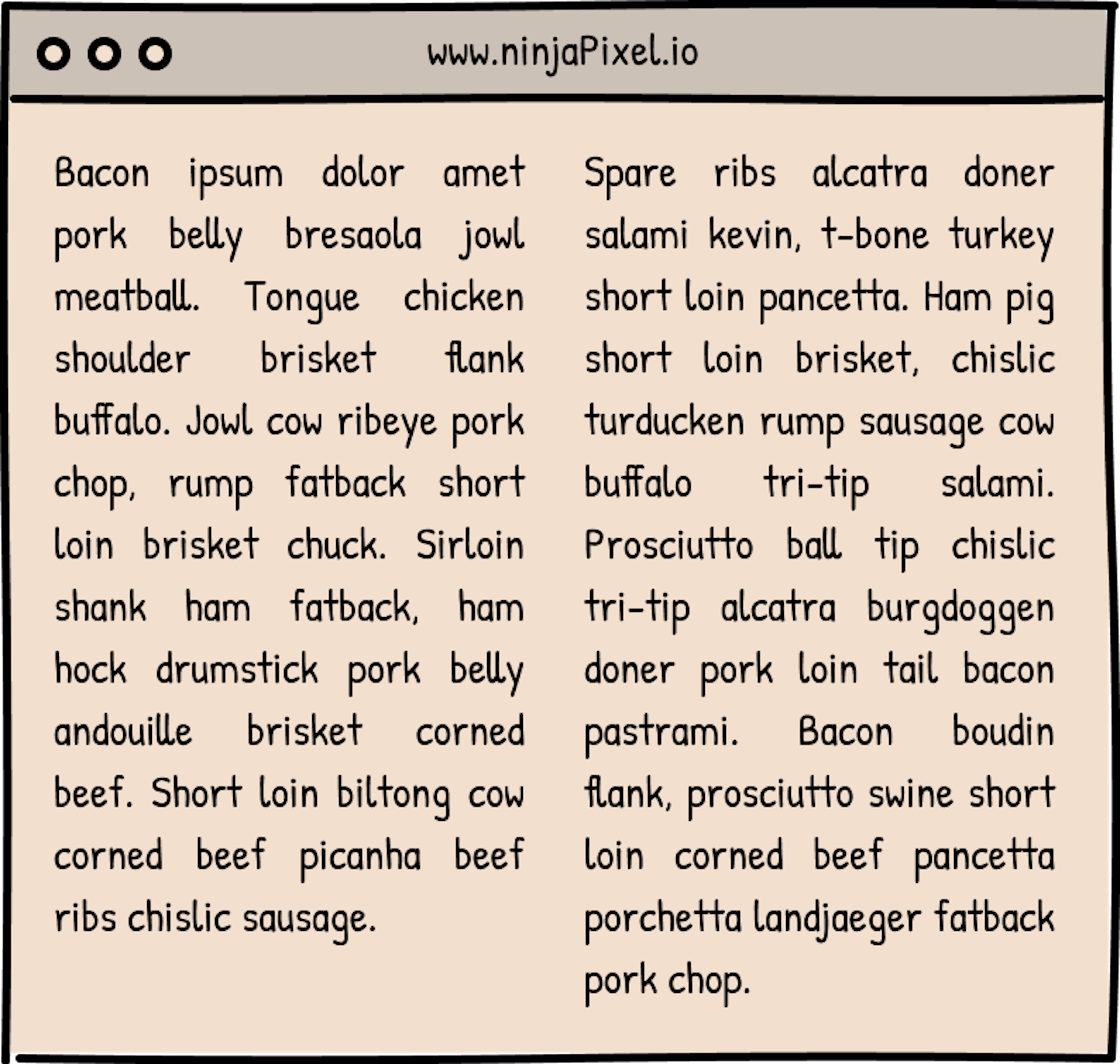
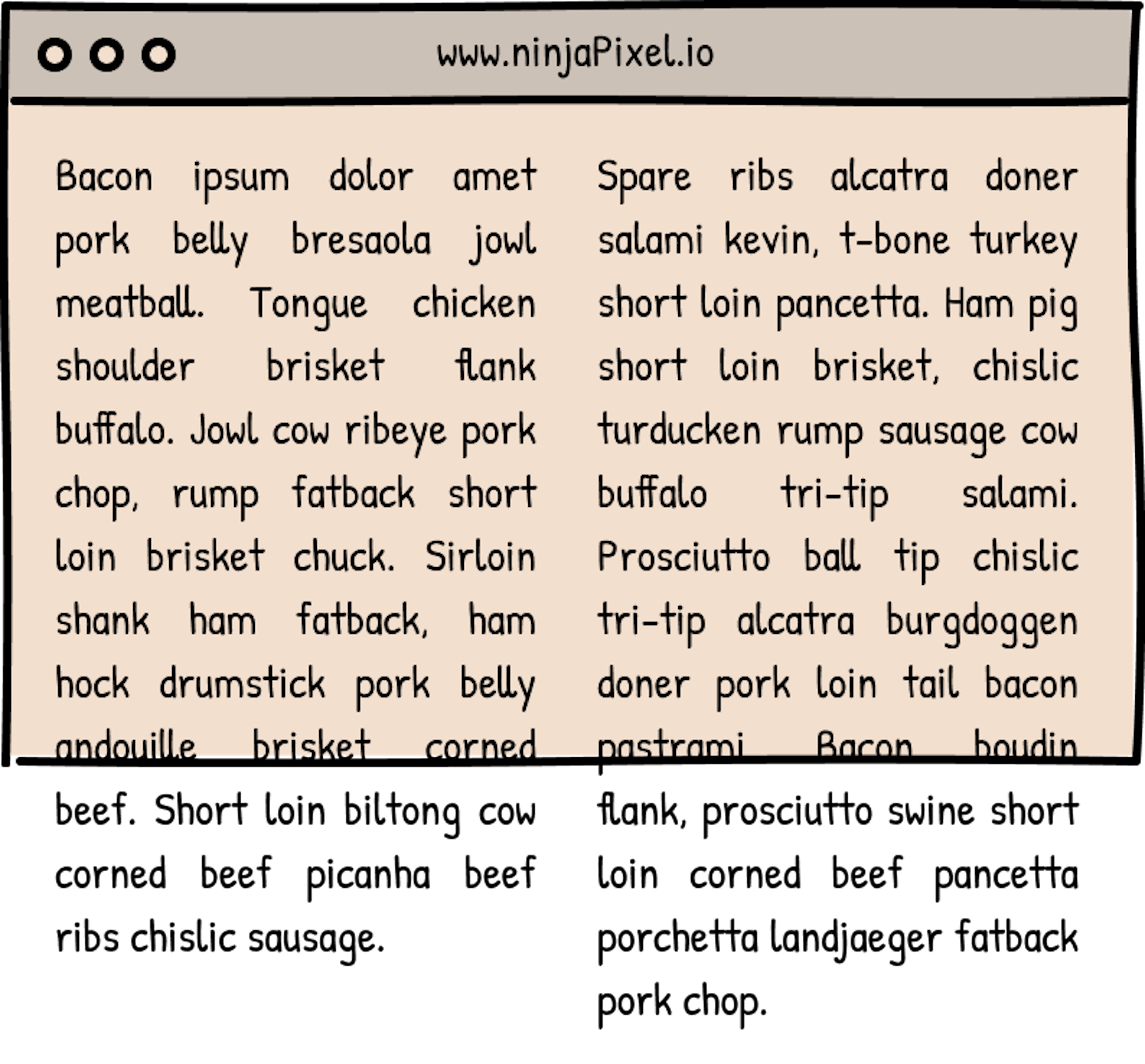
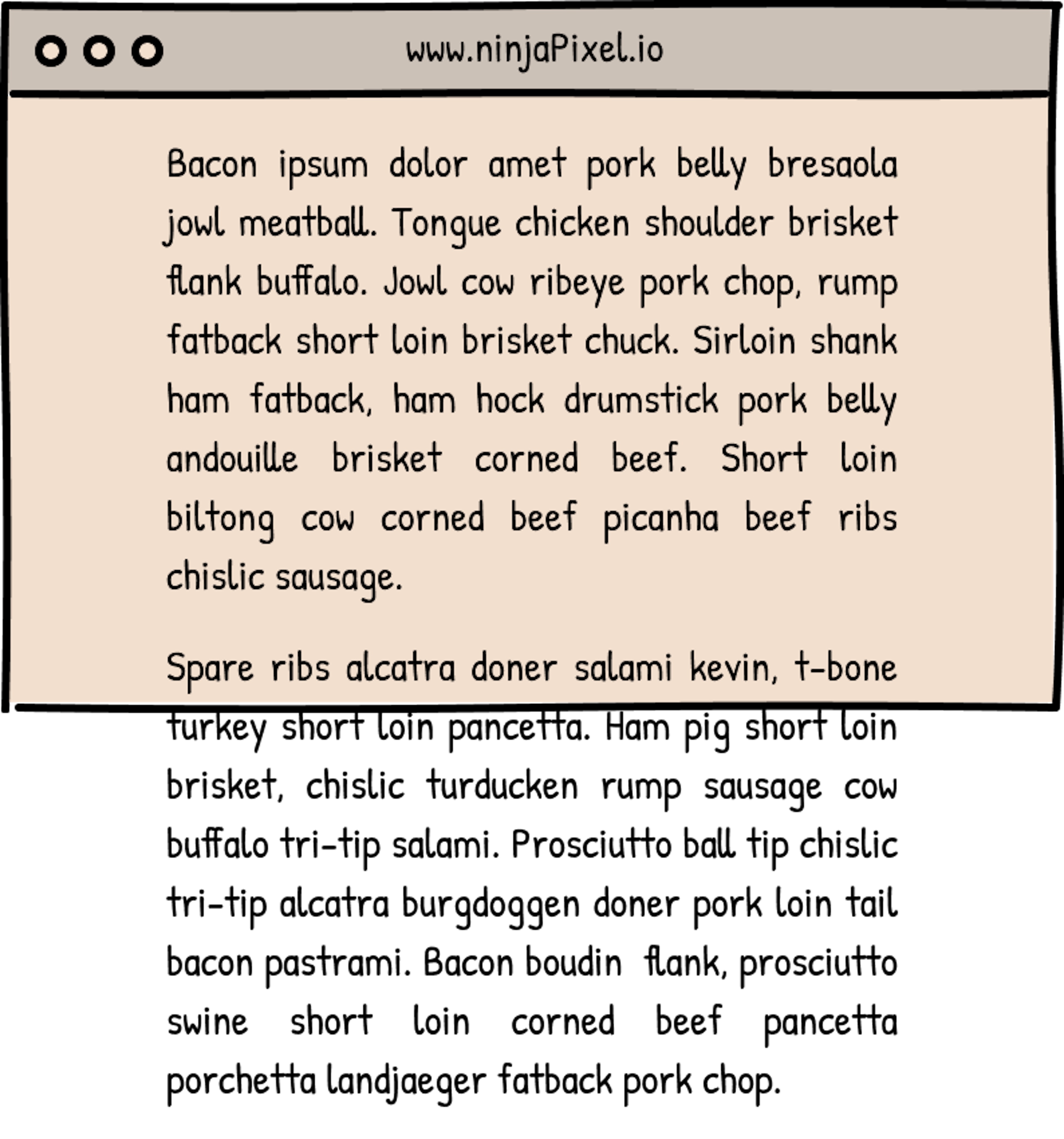
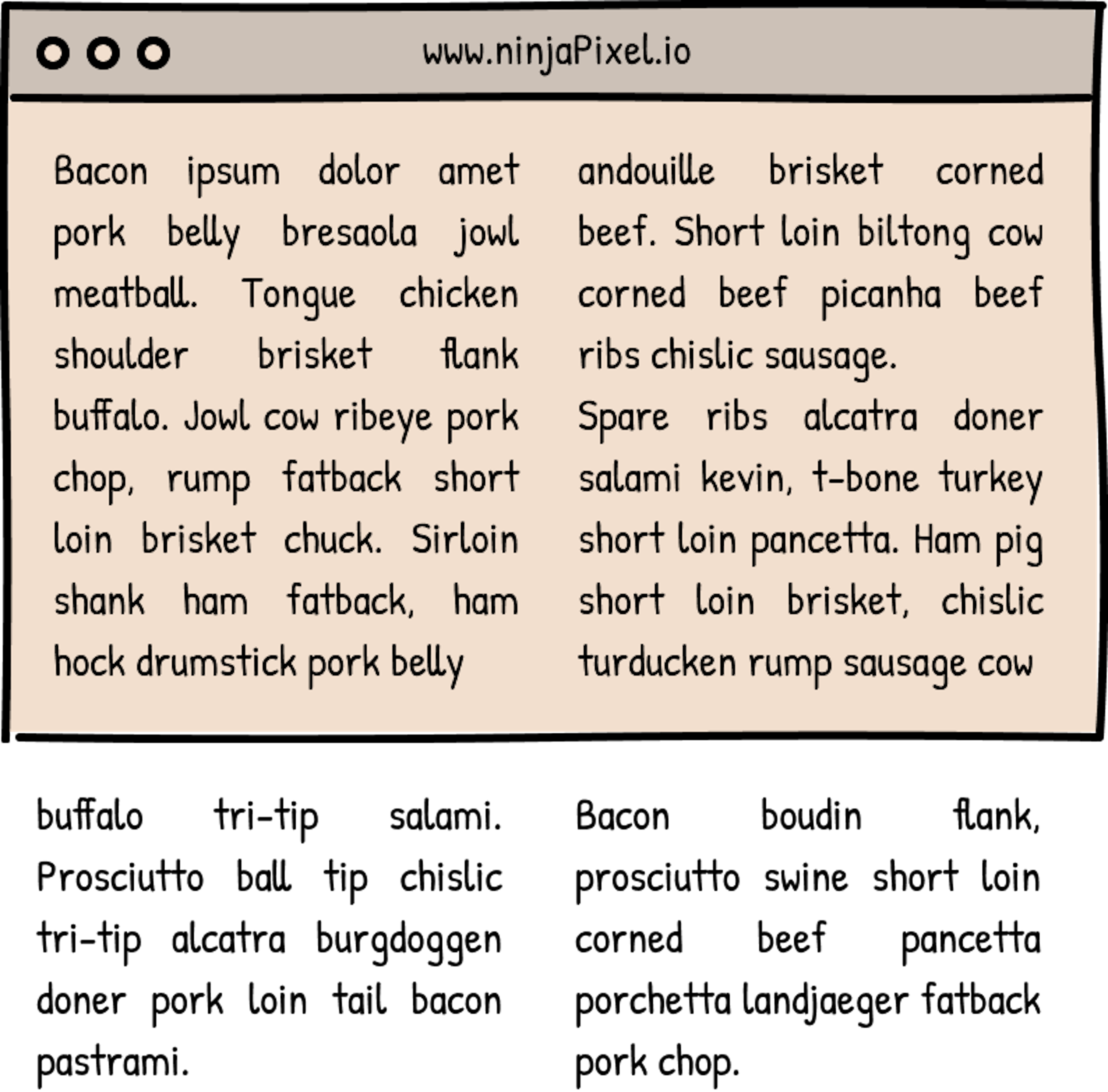
This website is a little playground for me, I’m a developer using it as a tool to become a better designer and one particular medium I’m drawn to for inspiration is print; I’ve been subscribed to WIRED magazine for a few years now and just love their layouts and their graphic design. I’ve dreamed of recreating their pages digitally, along with classic broadsheet newspapers like the New York Times and Financial Times (which I've loosely based the style of this page on). One thing that held me back was figuring out how to incorporate columns of text onto a web page. At first I just didn’t think it was possible to do this in CSS, recently I discovered that there is actually a pretty old property called columns that arranges your content into… columns. You can pass either a number (which will be how many columns your content is arranged in) or a length (which is how wide(ish) you want the columns to be). Additionally, the column-gap property allows you to specify the gap between the columns.
If you read this article on a screen that is greater than about 680px you'll see the page arranged in 2 columns, above about 1,050px and you'll see a 3+ column layout.


