macOS
Monterey


macOSMonterey
High powered meets
"Hi everyone".
Lorem ipsum dolor sit amet, consectetur adipiscing elit, sed do eiusmod tempor incididunt ut labore et dolore magna aliqua. Ut enim ad minim veniam, quis nostrud exercitation ullamco laboris nisi ut aliquip ex ea commodo consequat.
I hope you like that animation as much as I do. It's from the macOS Monterey homepage (and it was used on the Big Sur homepage, too). I've rebuilt it in React, using Greensock's animation library GSAP. Within the animation, there are four smaller animations going on. First, we've got the 'hero' text that remains pinned to the middle of the screen as you attempt to scroll down the page. It fades out after some scrolling and then the second animation kicks in: the background zooms out to reveal that you've been looking at a MacBook all along... While this is taking place, the third animation also happens - a bunch of apps and the dock bar fly onto the laptop. Finally, as you get to the point where you're scrolling the laptop off the page, it momentarily pins in place, further scrolling reveals more text on the page.
In this post I'm going to break down (with code examples) how to recreate this experience. I'll be using React, GSAP for the animations and CSS for styling/layout. I'm not sure how Apple coded their own page but it certainly wasn't using this stack, I've got a feeling that it may have been autogenerated by a design tool or something (if you know how they made it, let me know!). Anyhow, I'll show you how to recreate these animations yourself.
Animation 1
The first animation does two things:
- 'Pins' the page so that scrolling doesn't scroll the page. This ensures that the hero text stays center.
- Fade the hero text to an opacity of zero.
macOS
Monterey
This is really simple to achieve using GSAP. You just need to register the 'ScrollTrigger' plugin and then tell it to 'pin' the element and to 'scrub', which basically means that the scroll wheel should be used to progress the animation rather than the default behaviour of just playing the animation from start to finish once it is triggered. The animation itself is as simple as it gets: finish at an opacity of 0. Here's the crux of it (at the end of the post I'll include all of the React and CSS code necessary to create the entire animation at the top of this page).
const timeline = gsap.timeline({
  scrollTrigger: {
    trigger: rootRef.current,
    pin: true,
    scrub: true,
    start: "top top",
  },
});
timeline.to(textContainerRef.current, {
  opacity: 0,
});
Animation 2
The second animation is my favourite. I really like that scrolling is used to control the zoom level on the element, and it's a really delightful interaction to reveal the MacBook. Here's what the second animation looks like all on its own:

Again, the code behind this animation is quite simple, once you know how to use GSAP. Basically we just 'pin' the element when it hits the top of our browser window and then apply the animation as the user scrolls. The animation gradually zooms back out to a scale of 1. Here's a basic code sample of how to do this, but the real-world code is a bit more complicated as I need to take mobile devices into account - their portrait orientation requires a greater scale factor to cover the screen.
const timeline = gsap.timeline({
  scrollTrigger: {
    trigger: divRef.current,
    pin: true,
    scrub: true,
    start: "top top",
  },
});
timeline.from(imgContainerRef.current, {
  transform: "scale(2.2)",
});
Animation 3
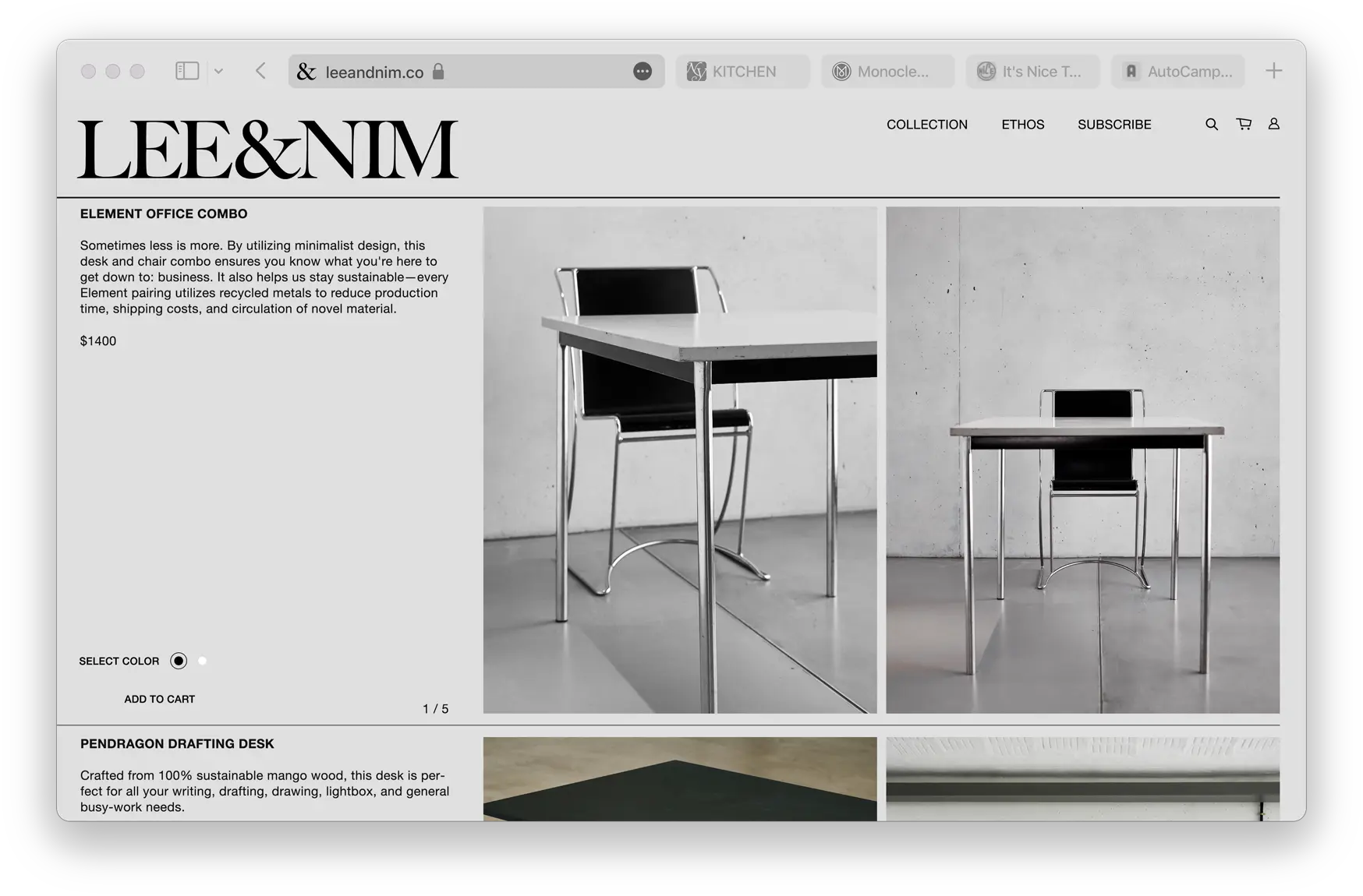
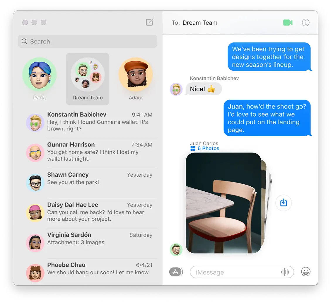
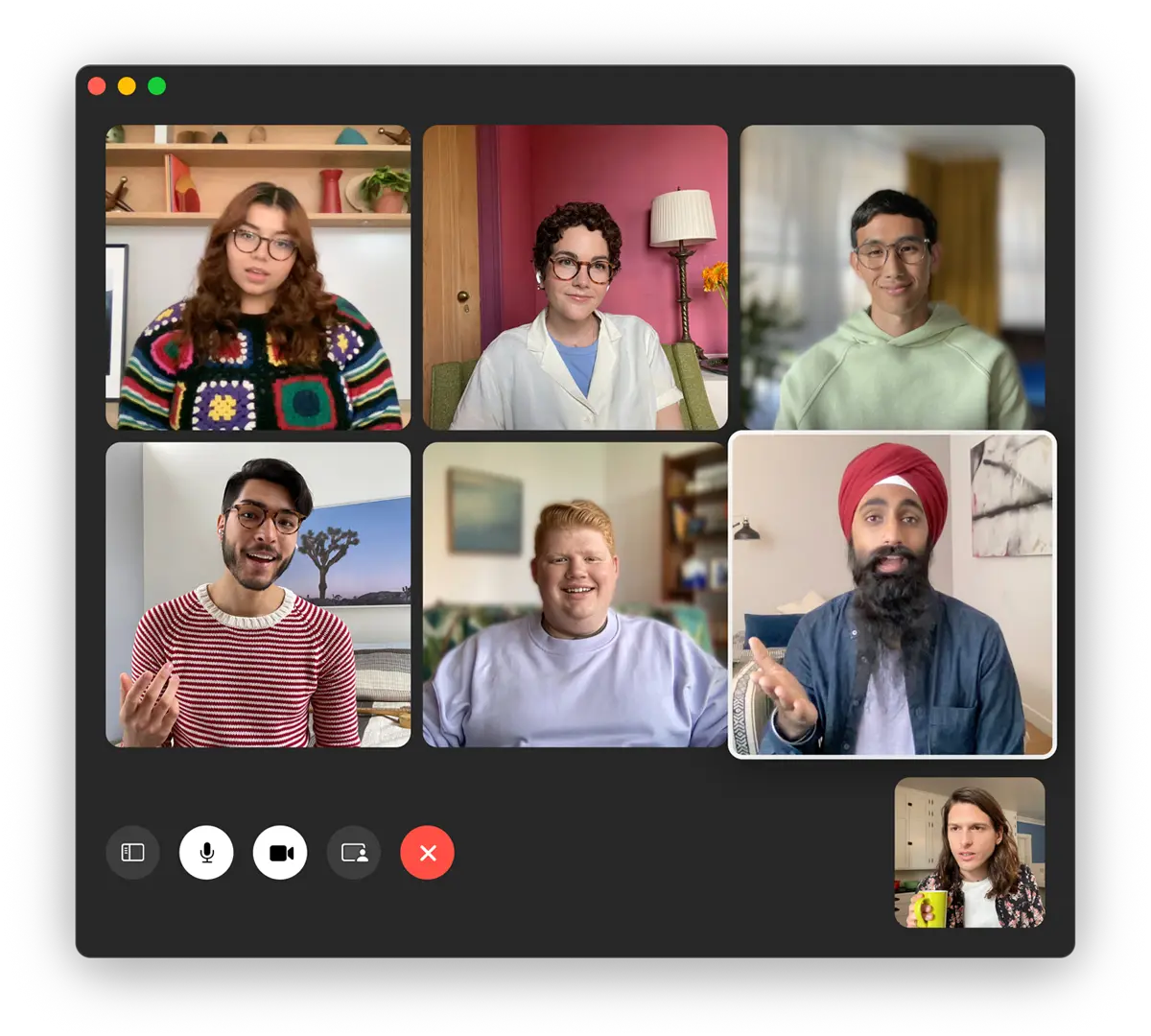
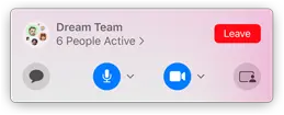
This is the hardest part of the sequence to get right. Animating the apps flying in isn't hard, what is hard is placing them in the correct position relative to the laptop screen. Here's how I want the elements laid out once the animation finishes.


By using position: absolute on these items and setting their top, bottom, left and right CSS properties to appropriate values (I use % units to make this responsive) I'm able to arrange the apps as I want.
With the relative layout of these items figured out, I now need to position the whole component bang over the laptop image. This is done by ensuring that the component has the same aspect ratio as the laptop screen. Just to complicate matters slightly, the base laptop image is not perfectly symmetrical and the center of the image is not the center of the laptop's screen, so we also need to adjust for that. You can checkout the .appsContainer CSS class at the end of the post to see how this was done.


With all of that out of the way, we can finally get on to the fun stuff, the animation!


With each app, I position the image offscreen (using GSAP) and then animate it to the final position. Each of these animations is offset slightly (offset in time rather than offset by position!) using the delay property. To illustrate, here's how I animate the Safari window, note the string "apps" at the end of the function call. By tagging all of the components in this animation with "apps", they will all start at the same time (though, as mentioned above, they will all be staggered somewhat).
timeline.from(
  safariRef.current,
  {
    delay: 0.1,
    left: "-110%",
    top: "-30%",
  },
  "apps"
);
Animation 4
The final piece of the puzzle. Kinda an interesting interaction... once all of the laptop-based animations are over and it's been un-pined, you are able to scroll the page again. As you start scrolling the laptop out of view a strapline gently appears at the bottom of your screen, animating to full opacity and drifting ever so slightly up the page. Then the page pins again; no animations occur, and you're forced to slow down and actually read the strapline as you continue scrolling your mouse but the screen remains pinned.
laptopImage.pngmacOSMonterey
High powered meets
"Hi everyone".
Lorem ipsum dolor sit amet, consectetur adipiscing elit, sed do eiusmod tempor incididunt ut labore et dolore magna aliqua. Ut enim ad minim veniam, quis nostrud exercitation ullamco laboris nisi ut aliquip ex ea commodo consequat.
I previously said that animation 3 was the trickiest one; I'd like to recant my statement.
function createRevelTextTimeline() {
  /*
    When the bottom of the laptop image hits the 70% mark on the screen,
    start revealing the text.
   */
  const timeline = gsap.timeline({
    scrollTrigger: {
      trigger: laptopRef.current,
      scrub: 1,
      start: "bottom 70%",
      end: "bottom 60%",
    },
  });

  /*
    The text fades in and each block of text creeps into place.
    All off these animations occur at different times.
   */
  timeline.from(
    textContainerRef.current,
    {
      opacity: 0,
      duration: 5,
      ease: "slow",
      delay: 2,
    },
    "move"
  );

  const tween = {
    delay: 3,
    duration: 0.9,
    ease: "power1",
    top: 4,
  };

  timeline.from(text1Ref.current, tween, "move");
  timeline.from(text2Ref.current, { ...tween }, "move");
  timeline.from(
    text3Ref.current,
    { ...tween, top: tween.top * 5, duration: tween.duration * 2 },
    "move"
  );
  timeline.from(
    text4Ref.current,
    { ...tween, top: tween.top * 10, duration: tween.duration * 4 },
    "move"
  );
}

/*
  Just before the last of the text appears on the screen,
  pin the text container (but still allow the laptop image to scroll)...
 */
function createPinTextTimeline() {
  const timeline = gsap.timeline({
    scrollTrigger: {
      trigger: text4Ref.current,
      pin: textContainerRef.current,
      start: "bottom bottom+=100px",
      end: "+=200px",
    },
  });
}

/*
  ...finally, also pin the laptop to the screen.
  It releases the pin at the same moment that the text container releases its pin
  and the whole page will start scrolling again as normal.
 */
function createPinLaptopTimeline() {
  const timeline = gsap.timeline({
    scrollTrigger: {
      trigger: text4Ref.current,
      pin: laptopRef.current,
      start: "bottom bottom",
      end: "+=100px",
    },
  });
}

createRevelTextTimeline();
createPinTextTimeline();
createPinLaptopTimeline();
So there we have it, how to recreate each of the individual animations on the Monterey home page. I'll share the code for the complete sequence in just a moment, but first I need to get something of my chest.
Safari iOS animation issues
While building this page I ran into some undesirable animation behaviours on iOS, namely:
- Stuttering
- Jumping
- Mis-alignment between the scroll position and the animation position (i.e they were out of sync)
This is a particular issue on iOS devices as the URL bar will disappear after a little bit of scrolling (and reappear if you scroll back up the page), if you don't know what I'm talking about take a look at this gif. I can see why the iOS designers have chosen to do this, it releases some vertical real-estate once the user has committed to reading a web page (and is therefore less likely to need the address bar), but it plays absolute havoc with animations! It is a real hair-puller-outer kinda thing and was easily the issue that I spent most time on when writing the animations on this page.
To solve this issue, the GSAP forums suggest wrapping everything in a fixed height div. This means that the body isn't scrolled and you'll trick Safari into not hiding the address bar.
This may fix the animation issue but it leads to a sub-optimal viewing experience: it breaks the standard way that Safari works so will just feel weird to the user (who is used to the scroll bar disappearing). So how did I fix the issue on this page? I passed a special configuration option to GSAP, declaring when it should refresh, purposely omitting browser resize events. This can be seen in the useRegisterScrollTrigger hook.
Update: Since writing this post, GSAP have released a new scroll trigger configuration parameter: ignoreMobileResize and, oh my Lord, does it cut out a feck load of code. Rather than having to detect the device type and then declaring which events GSAP should refresh on, all you need go do is this one simple trick to loose belly fat:
scrollTrigger.config({
  ignoreMobileResize: true,
});
So there we have it, how to recreate this animation from the Monterey product page. Below are all the files used to create the animation at the top of this page.
Check out more stuff like this on my home page. Thanks for reading ✌️
import LoadingScreen from "~components/monterey/LoadingScreen";
import {
  useAddToTimelineJustOnce,
  useRegisterScrollTrigger,
} from "~lib/hooks/GSAPHooks";
import { useOrientation } from "~lib/hooks/useOrientation";
import gsap from "gsap";
import React, { useCallback, useEffect, useState } from "react";

import styles from "./FullAnimation.module.css";

type Props = {
  /**
   * This callback is useful if you have subsequent animations on your page,
   * as you'll need to wait till this one has loaded, so that you (/GSAP) can
   * correctly calculate the position of prior items on the page.
   */
  onLoad?: () => void;
};
export function FullAnimation(props: Props): JSX.Element {
  const { onLoad } = props;
  const masterTimeline = React.useRef(gsap.timeline());
  const textHeroRef = React.useRef(null);

  const gsapReady = useRegisterScrollTrigger(gsap);

  /*
    note: we could reference elements by id, rather than creating a React ref for them.
  */
  const laptopContainerRef = React.useRef(null);
  const laptopRef = React.useRef<HTMLImageElement>(null);
  const imgContainerRef = React.useRef(null);
  const dockRef = React.useRef<HTMLImageElement>(null);
  const safariRef = React.useRef<HTMLImageElement>(null);
  const messagesRef = React.useRef<HTMLImageElement>(null);
  const facetimeRef = React.useRef<HTMLImageElement>(null);
  const sharingRef = React.useRef<HTMLImageElement>(null);
  const textRevealContainerRef = React.useRef(null);
  const text1Ref = React.useRef(null);
  const text2Ref = React.useRef(null);
  const text3Ref = React.useRef(null);
  const text4Ref = React.useRef(null);

  const initialScrollLength = 1200;
  const orientation = useOrientation();

  const createScrollAnimation1 = useCallback(() => {
    const timeline = gsap.timeline({
      scrollTrigger: {
        trigger: laptopContainerRef.current,
        pin: true,
        scrub: true,
        start: "top top",
        end: initialScrollLength,
      },
    });

    const scale = orientation === "landscape" ? 2.2 : 6;
    timeline
      .to(textHeroRef.current, {
        opacity: 0,
      })
      .from(imgContainerRef.current, {
        transform: `scale(${scale})`,
      });
    timeline.from(
      dockRef.current,
      {
        delay: 1.1,
        opacity: 0,
      },
      "apps"
    );
    timeline.from(
      safariRef.current,
      {
        delay: 0.1,
        left: "-110%",
        top: "-30%",
      },
      "apps"
    );
    timeline.from(
      facetimeRef.current,
      {
        delay: 0.3,
        left: "-110%",
        bottom: "-20%",
      },
      "apps"
    );
    timeline.from(
      sharingRef.current,
      {
        delay: 1,
        // Apple's page brings this element in directly from the top, but that doesn't
        // work so well with a vertically oriented screen, so I additionally offset it on the right.
        right: "-50%",
        top: "-50%",
      },
      "apps"
    );
    timeline.from(
      messagesRef.current,
      {
        delay: 0.8,
        right: "-110%",
        top: "120%",
      },
      "apps"
    );
  }, [orientation]);
  const createScrollAnimation2 = () => {
    // magic number to control when these animations end
    const end = orientation === "landscape" ? 480 : 380;

    // reveal the text that's below the MacBook
    const timeline = gsap.timeline({
      scrollTrigger: {
        trigger: textRevealContainerRef.current,
        pin: true,
        scrub: true,
        start: initialScrollLength + 180,
        end: initialScrollLength + end,
        anticipatePin: 1,
        onEnter: (scrollTrigger) => {
          scrollTrigger.refresh();
        },
      },
    });

    timeline.from(
      textRevealContainerRef.current,
      {
        opacity: 0,
        // ease: "slow",
        // duration: 3,
      },
      "move"
    );

    const tween = {
      delay: 3,
      duration: 0.9,
      ease: "power1",
      top: 4,
    };
    timeline.from(text1Ref.current, tween, "move");
    timeline.from(text2Ref.current, { ...tween }, "move");
    timeline.from(
      text3Ref.current,
      { ...tween, top: tween.top * 5, duration: tween.duration * 2 },
      "move"
    );
    timeline.from(
      text4Ref.current,
      { ...tween, top: tween.top * 10, duration: tween.duration * 4 },
      "move"
    );

    // pin the MacBook a little after we reveal the text underneath it
    const timeline2 = gsap.timeline({
      scrollTrigger: {
        trigger: laptopContainerRef.current,
        pin: true,
        scrub: true,
        start: initialScrollLength + 250,
        end: initialScrollLength + end,
        // on mobile, I find that using anticipatePin helps when scrolling fast
        anticipatePin: 0.5,
      },
    });
  };

  const [loadedImageCount, setLoadedImageCount] = useState(0);
  const totalImages = 6;
  const imagesLoaded = loadedImageCount === totalImages;
  const ready = gsapReady && imagesLoaded;

  useEffect(() => {
    if (ready && onLoad) {
      onLoad();
    }
  }, [ready, onLoad]);

  useAddToTimelineJustOnce(ready, createScrollAnimation1);
  useAddToTimelineJustOnce(ready, createScrollAnimation2);

  return (
    <div>
      {!ready ? <LoadingScreen></LoadingScreen> : null}

      <div
        id="outer"
        className={styles.laptopContainer}
        ref={laptopContainerRef}
      >
        <div ref={textHeroRef} className={styles.textHero}>
          <p>macOS</p>
          <h2>Monterey</h2>
        </div>
        <div ref={imgContainerRef} className={styles.heroHardware}>
          <img
            alt=""
            ref={laptopRef}
            id="image"
            src="/monterey/macbook_pro-min.webp"
            className={styles.img}
            onLoad={() => {
              setLoadedImageCount((prev) => prev + 1);
            }}
          />
          <div className={styles.appsContainer}>
            <img
              alt=""
              ref={dockRef}
              src="/monterey/hero_dock.webp"
              className={styles.imgDock}
              onLoad={() => {
                setLoadedImageCount((prev) => prev + 1);
              }}
            />
            <img
              alt=""
              ref={safariRef}
              src="/monterey/hero_safari.webp"
              className={styles.imgSafari}
              onLoad={() => {
                setLoadedImageCount((prev) => prev + 1);
              }}
            />
            <img
              alt=""
              ref={messagesRef}
              src="/monterey/hero_messages.webp"
              className={styles.imgMessages}
              onLoad={() => {
                setLoadedImageCount((prev) => prev + 1);
              }}
            />
            <img
              alt=""
              ref={facetimeRef}
              src="/monterey/hero_facetime.webp"
              className={styles.imgFacetime}
              onLoad={() => {
                setLoadedImageCount((prev) => prev + 1);
              }}
            />
            <img
              alt=""
              ref={sharingRef}
              src="/monterey/hero_sharing.webp"
              className={styles.imgSharing}
              onLoad={() => {
                setLoadedImageCount((prev) => prev + 1);
              }}
            />
          </div>
        </div>
      </div>
      <div ref={textRevealContainerRef} className={styles.textRevealContainer}>
        <p className={styles.text1} ref={text1Ref}>
          <b>macOS</b>Monterey
        </p>
        <p className={styles.text2} ref={text2Ref}>
          High powered meets
        </p>
        <p className={styles.text3} ref={text3Ref}>
          "Hi everyone".
        </p>
        <p className={styles.text4} ref={text4Ref}>
          Lorem ipsum dolor sit amet, consectetur adipiscing elit, sed do
          eiusmod tempor incididunt ut labore et dolore magna aliqua. Ut enim ad
          minim veniam, quis nostrud exercitation ullamco laboris nisi ut
          aliquip ex ea commodo consequat.
        </p>
      </div>
    </div>
  );
}